
Twitter has now rolled out its new profile pages and there are quite a few improved features. Here’s how to get it (if you haven’t yet) and what you need to know.
First of all, if you haven’t noticed your Twitter profile changing, you can get the new profile by going to this page and at the bottom click ‘Get it now’.
Old style Twitter profile page
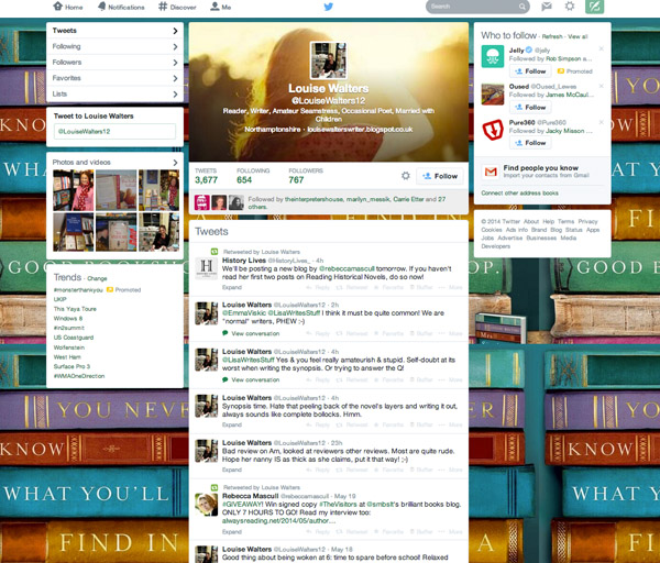
The first obvious change is the layout – instead of the old version with a full-screen background and a header image the width of the main column of tweets, we now have a full-width header with your Twitter avatar (the image that represents you) offset to the left. The look is a bit like Facebook, and indeed some people have criticised Twitter for merely imitating Facebook rather than coming up with something more original.

New style Twitter profile page
Personally I quite like the new look. Having the larger avatar, plus the name and description on the left feels clearer and cleaner, and I also like the additional detail of showing the date joined. Also on the left we now have a feature ‘Followers you know’, which, again in a Facebook-esque touch, is designed to help you decide whether this person is worth following.
Underneath the header, a horizontal menu now gives pride of place to the stats (numbers of tweets, photos, followers, following, favourites.) It’s a shame that Lists is now relegated to the ‘More’ dropdown menu, as I think it makes this great (and under-used) function even more hidden. But the other advantage of the layout is that the tweets themselves are now higher up on the page and centre-stage.
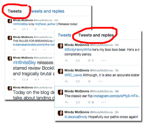
Another welcome improvement is the ability to filter out all the @ replies. This means that unless you click on ‘Tweets and replies’ when you view someone’s profile, you don’t have to wade through all the one-to-one back-and-forth conversations that go on. Not that @ replies are a bad thing – far from it, as they can be an indicator that a person is actually engaging with people, and not a broadcaster or a robot. But for a quick assessment of the quality of a person’s tweets, it’s easier when you can opt to just view their ‘open’ tweets.
You’ll notice that in the new profile some tweets appear enlarged. This happens to your most retweeted or favourited tweets, as a way of highlighting them, so the visitor’s eye is drawn to your ‘Best Tweets’. And another way of drawing attention to specific tweets, but this time it’s under your control, is to ‘pin’ a tweet to your page. This means it stays at the top of your tweet stream until you ‘unpin’ it. Again, the highlighting and pinning functions are not unlike Facebook, so if you’re familiar with Facebook you’re get the idea right away.
So what should you do with your new profile?
Do the following – start by clicking on the ‘Edit Profile’ button on the top right of your profile page.
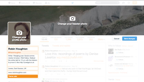
- Create and upload a suitable header image. You have ONE big image now – it’s prime real estate, so don’t waste it. See how Mindy McGinnis (above) has used hers to promote her latest book. But it could equally be something more abstract or atmospheric – just choose an image that says something about you.
Size: Twitter recommends 1500 pixels wide x 500 pixels high, but on a large screen that will be stretched out beyond looking nice. So go for bigger – 3000 x 1000 pixels would be good, at as high a resolution (dots per inch) you can manage, for good quality. There’s a 5MB maximum size though – and if you exceed this it’s likely you’ll just find it takes AGES to load (and never does) – you don’t always get told what the problem is, but it’s likely to be size.
2. Create and upload your avatar. This should be 400 x 400 pixels. On your profile it appears at 200 x 200, and smaller on your tweet stream of course. But when someone clicks on it they’ll see the large version. The main thing is to make sure the quality is good and the image still viewable when shrunk.
The good news is that you no longer need a background image. With the old layout it was always a faff to create a background image with logos or writing or images on it, because bits of it were always going to be obscured. So just choose a plain colour that complements your header and other colours (text, links etc). I think you’ll be pleased with the final effect.
Robin Houghton
Writer & fledgling poet. Social comms mentor & trainer. RSA Fellow. Walked the online talk for 15yrs with the blisters to prove it. Author 'Blogging for Writers' (Ilex, 2014)